Exploratory analysis
Line plots
Line plots are the first visual aid in time series data analysis. T
check time series characteristics and regularity
outliers
interpolation errors
…holes!
We often have datasets with too many time series to be plotted together
In this case, we can rely on quantile plots or box-plots
Scatter plots
A scatter plot can be used to visually assess the dependence of the target from exogenous inputs/features .
Embeddings
Time embedding is helpful to see whether one can reduce the variance of segments in the time series to be predicted.
What is wrong with these time series of power measurements?
Power measurements from MV stations in Kenya. Top: heatmap embedded as daytime-day. Bottom: embedded time series plots.
Animations
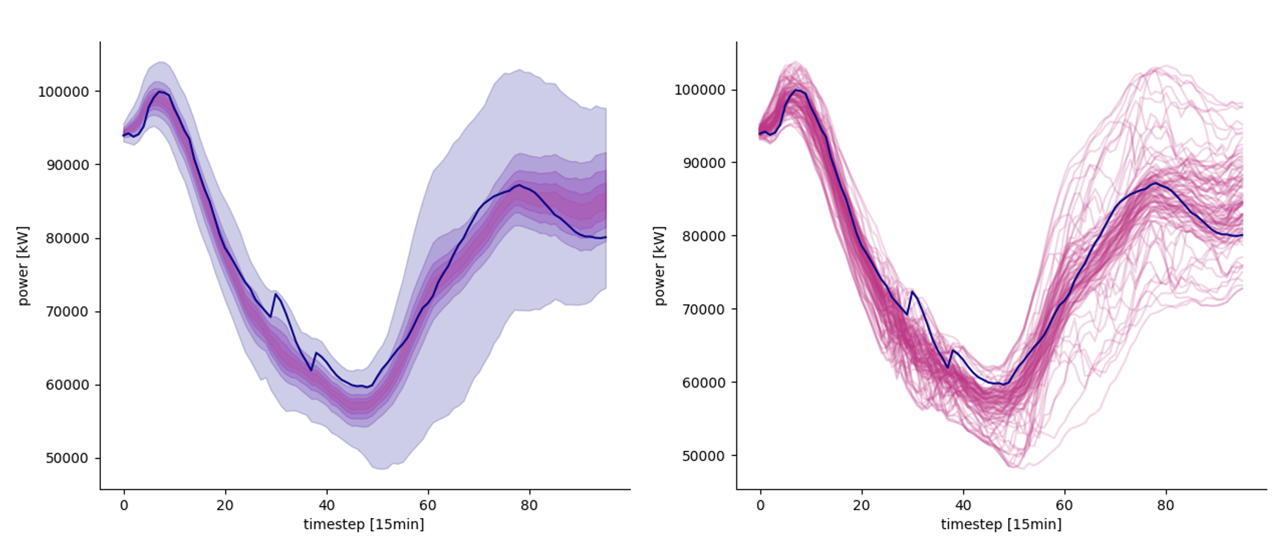
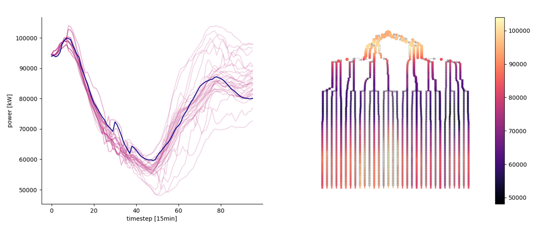
Probabilistic predictions
Left: predicted quantiles. Right: 100 different scenarios
Left: a stochastic scenario tree obtained from the scenarios. Right: graph representation of the tree
Model diagnostics
Since we are usually interested in more than one step ahead forecasts, we need good ways to visualize our model performances in more than one dimension.
Given a loss , where is the number of steps ahead (forecasting horizon), and stands for the prediction done at time t for the step t+h, we can decide to investigate the loss as a function of h.
A loss function binned for time of the prediction and forecast’s hour ahead.
Quantile loss functions for different quantile levels and different step ahead.
Reliability plot for different quantile levels and different step ahead


